

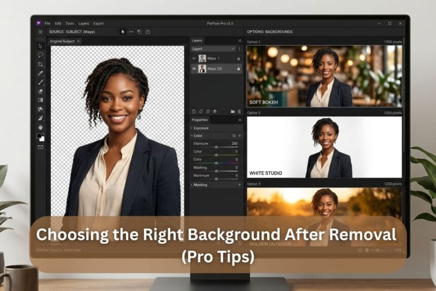

Many editors take too much time to clean up a background to a spotless finish – then put down a plain white one and declare it finished. Sound familiar? The background removal is not the whole story, as most professionals have often put it. Regardless of who does the work (photographers themselves or business services that can take away their backgrounds), what goes behind the subject is what actually makes the difference between a professionally looking photo and a painfully amateur one.
Background removal services have increased at a very high rate in the realms of e-commerce, wedding photography, and brand content – but not many are talking about what you do with them after the removal. Selecting an appropriate replacement background is an art worth learning and it will change the effect of a final image entirely. Let’s break it down like a pro.
Why the Right Background Makes or Breaks a Photo
A background is not an empty space but it is a part of the visual narrative. It has an effect on mood, it pulls the eye of the viewer and conveys a meaning. Set the same topic on a warm, rough wall and a cold grey gradient, and immediately two diametrically opposite emotions are created. Color psychology is a major factor here. Warm colors produce intimacy, cool colors imply a business-like demeanor and a neutral background maintains concentration and elimination of distractions.
The bottom line? An otherwise perfect edit can be ruined by the wrong background choice.
Types of Backgrounds and When to Use Them
Backgrounds are not created equally. Here’s a quick guide:
- Solid Colors: Best fit in e-commerce and product photography. Minimal, conversion-friendly and clean.
- Gradients: Softly add depth but not too distracting. Excellent in headshots and portraits.
- Blurred / Bokeh: Dreamy and natural. An excellent wedding and lifestyle photographer.
- Backgrounds (marble, wood, linen): Textured backgrounds are especially useful in food and product photography when you want to add some warmth and personality.
- Environmental / Outdoor: Best in storytelling and editorial, as well as destination shoots.
Pro tip: Always match the background style to the photo’s purpose, not personal taste alone.
Also Read: Creative Background Removal Ideas for Modern Marketing
Pro Tips for Matching Background to Subject
Good editors are great at this point. All these five principles do the trick:
- Respect the Color Palette: The background must enhance – but not conflict with – the outfit of the subject or the color of the product or her skin tone. Using a color wheel helps. Complementary colors and analogous colors form harmony and contrast respectively.
- Select Lighting Direction: Disagreement with lighting is one of the largest giveaways of a fake background. When the subject is left-lit, the background must be of the same source as the light. Otherwise, the composite appears to be unnatural at first.
- Stay Contextually Apposite: A bride who is captured in a studio should not pop up out of the blue floating in the midst of a desert. Relevance to the background is a graphical credibility and remains in narrative.
- Apply the Contrast Rule: Darker backgrounds should be used to show up light subjects. Dark themes require a light background to be defined. Minimalist – yet, so mighty, indeed.
- Avoid Visual Competition: When a background is very patterned, brightly colored, or has a lot going on in it, it will compete to be noticed with the subject. The role of the background is to serve, and not to take over.
Tools and Techniques for Realistic Background Integration
The most suitable background can pass as fake even when integrated. The way professionals close the deal is as follows:
Blend modes and edge masking can eliminate cutout lines with Photoshop. It is important to match the noise level of the background and subject as well as match the grain of the subject to the background–a sharp subject on a smooth, noisy-free background always appears to be composited. Placements can be made believable by adding drop shadows or ground reflections where they occur in order to stabilize the subject.
To perform faster work processes, AI-based applications such as Adobe Firefly and Canvas replacer backgrounds are suitable when making simpler edits. Nonetheless, when it comes to commercial / high-stakes photography work, manual editing provides the finest and the most natural output.
Common Mistakes to Avoid
These are the pitfalls of even seasoned editors:
- Putting a pixelated low-resolution subject on a high-resolution background.
- The disregard of the consistency of shadows and highlights on the subject and background.
- Using the same background template on each project.
- Selecting backgrounds that are either too loud, or too tonally close to the subject.
- Omitting to smooth hair, fur or fineness of edges after background erasing.
All these errors indicate to the viewer (knowingly or not) that something is amiss.
Conclusion
The background selected after removing it makes a good photo a compelling image. It involves a good knowledge of color, light, context and composition – all work together beautifully. Irrespective of the nature of the project, be it product pictures, portraits, or wedding albums, these pro styling guidelines instantly boost the overall outputs.
Photographers and businesses will find Visuals Clipping an excellent service provider to provide professional editing solutions based on their every creative requirement with a background removal service that offers high quality and precision background removal services that will yield clean and sharp final results that can be used anywhere. Since great editing does not begin and end with removal, it actually begins there.